Limits Computed from Your Data Show Assay Controls are Good
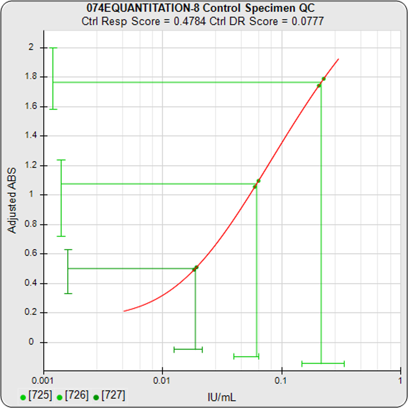
In the STATLIA MATRIX assay report control graph on the left, the response and dose of each assay control are plotted as a green line against its confidence limits. The response and dose lines are green when inside their limits, or red when outside. When the response and the dose are both outside their limits, this indicates that the control itself, not the assay, is bad.
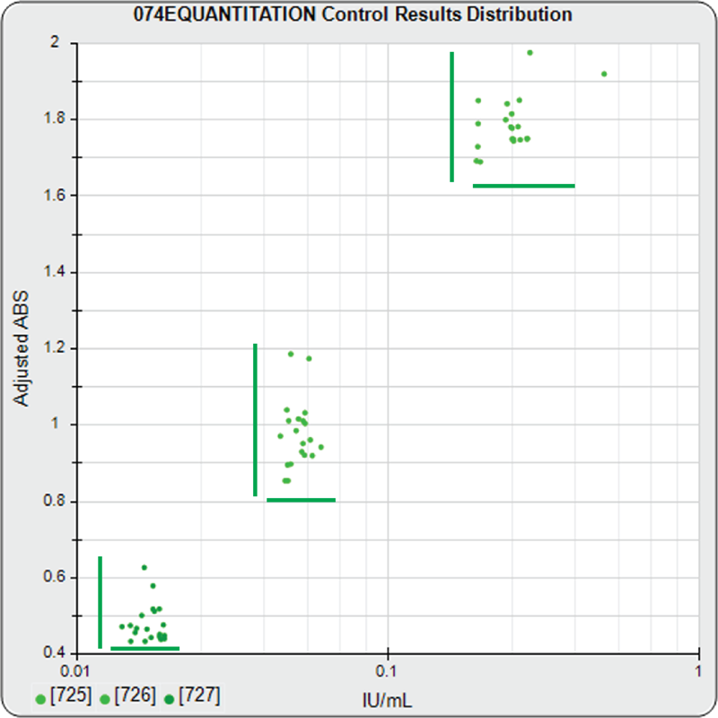
The response and computed dose of each control from the lab’s previously run assays are plotted in the middle graph in the software’s Performance Analysis report for the test method. Starting with just 6 assays, confidence limits are computed automatically for the response and dose of each control from these data points, after filtering out any outliers. You can use these limits or enter your own for the assay.
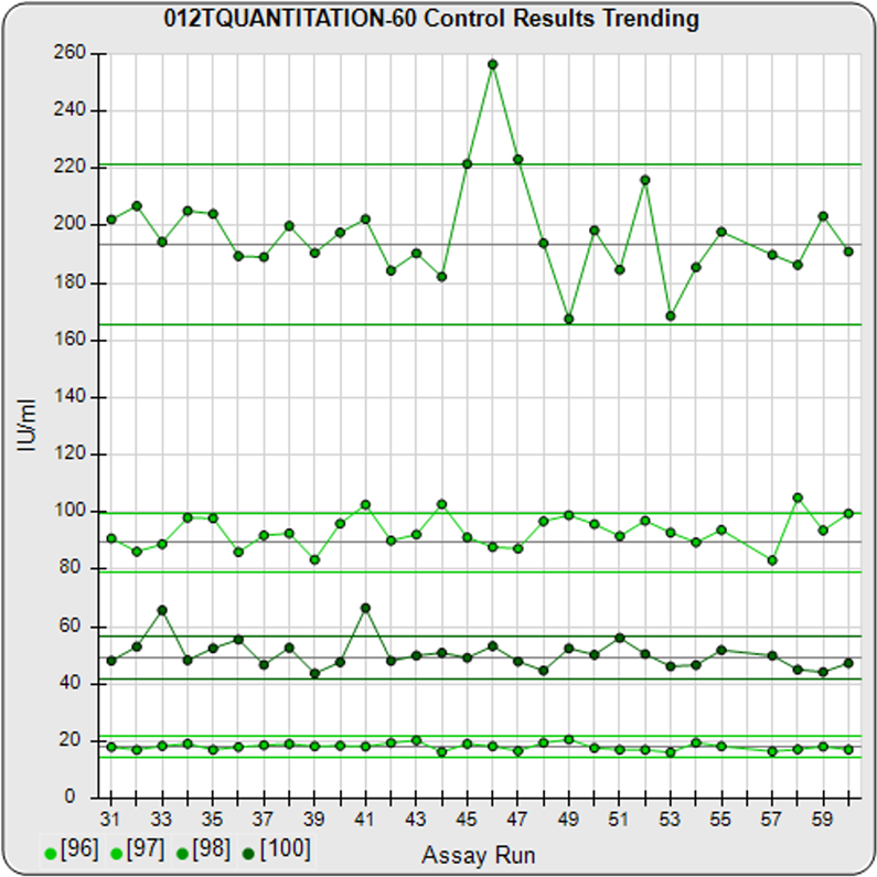
Each control in an assay on the trending graph on the right shows the concentration results and limits for the most recent assays. By plotting all of the controls on the same graph, it is easy to see the concentration positions for each control relative to each other and the standard curve doses on the Y-axis.
Assay Control graphs show that dose, without response, is only half the story.
Controls and other metrics are included in the automated pass /fail QC Acceptance section in STATLIA. These and other graphs and metrics in the software provide more information about the QC metrics you track.


