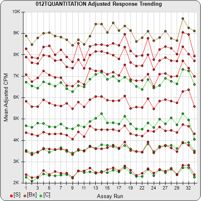
STATLIA MATRIX plots the responses of each baseline, standard, and control dilution for each of your pooled assays so you can track the trending of your responses from assay to assay, as shown in the first graph. Individual graphs are plotted for your raw responses, your responses adjusted to remove label variation when a tracer is assayed, and your responses normalized to your highest response dilution, and your Y-axis responses.
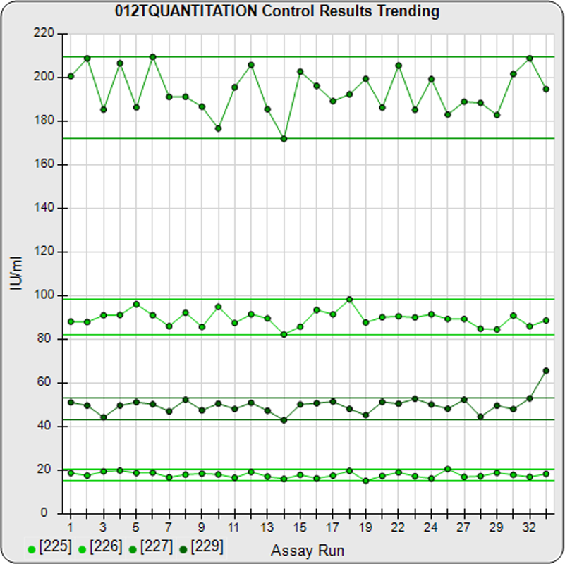
The results from each individual control specimen are also plotted for each assay, as shown in the second graph, along with each control’s respective confidence limits computed from their pooled assays or established by the laboratory.
The individual dilutions and control specimens are all color coded so they can be easily distinguished.